Last night I finished putting up all the patches on my design wall for the Streak of Lightning quilt. I believe that a design wall is one of the most important things in a quilter's studio. When I teach a class, I assign it as homework for any quilter who does not have one. I realize that the wall takes space. If that's a problem for you I will reply with, "where there's a will, there's a way!" The wall can be portable or permanent. The best design choices and quilt "conversations" happen sitting in a chair, looking at the design wall, and evaluating your desicions before proceeding.

Naturally, as this quilt emergedl I had to make specific fabric choices - especially for the zig-zag streaks running vertically between the nine-patches. My initial thoughts were to make a few of them very bright so they would stand out. As the quilt grew on the design wall (from left to right) I began second guessing some of those choices. However, rather than trying to fix anything at the moment, my tried and true advice is to just keep moving forward - keep evaluating - and since nothing is sewn (except the nine-patch units) I can move, rearrange or replace anything. I didn't want to stop and fix anything until I saw the full quilt on the design wall. In this case, if I had stopped my progress to redo a streak, I would still be uncertain and probably slow the progress of getting the overall design on the wall.

Last night when all the patches were on the wall I sat and studied my progress. There were three places that bothered me, and they were the same three sections that had bothered me over the past few days. Here is what the quilt looked like before I went to bed.


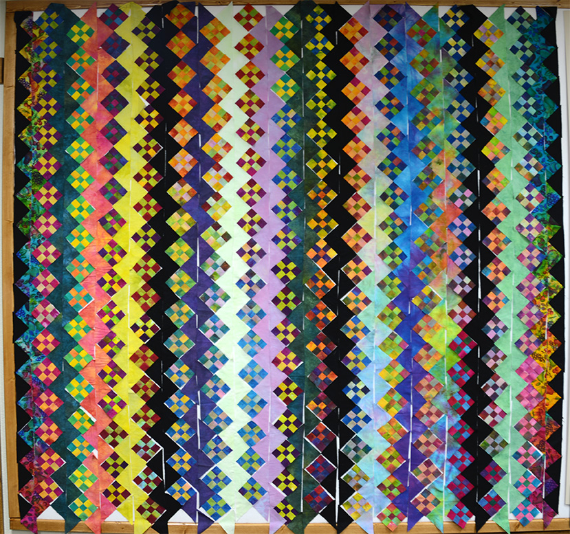
The three streaks that seemed out of place to me are the orange/coral, the bright yellow, and the bright mint green. I don't dislike those streaks and I could have left them in. I really liked the entire right side of the quilt. The thing I liked best was the use of my Caveman Pastel (I call it my Miracle Fabric). It is the seemingly iridescent streak just to the right of the second black streak. It is not a fabric that folks gravitate to, but for me it creates the miracle of movement in light areas. We all know that we need 'lights' even though they are not fun to purchase.

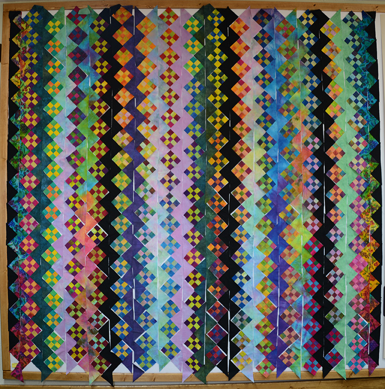
So, this morning I replaced the coral, yellow, and mint green streaks with some miracle fabric and another multi-color. Compare the two and I think you'll agree that they both look good, but the second version (shown below) is more cohesive across the design. 


Related blog to this post - HERE.

Unrelated Trivia:
Yesterday I worked on this quilt about 12 hours.
I had a glass of milk this morning for breakfast
I watched a lot of The Universe on History 2 yesterday. This morning it's been Cowboys and Outlaws (Tom Horn) on H2 
Today's To-dos: Edit Gammill and Bernina videos. Work on this quilt. My threads arrived - so maybe more longarm quiltling - whoo-hoo!

All this and more.... I'm just sayin'...

Comments   

#13 Barbara Blanchard 2012-08-25 23:03
The first version is more dynamic. However, there's a larger problem, and that's the streak to the left of the first full black streak on the right - the one that looks like caveman pastels on steroids. It's gorgeous fabric, but out of place here because of a lack of contrast (and it looks like you used it again to replace the yellow streak). Alternatively, keep the streak and replace the nine patch blocks to the left with something with more contrast.
#12 marlis 2012-08-16 07:49
Ricky, I love the changes..
#11 Therese May 2012-08-15 23:47
I prefer the second one without the white strip. the second blends so much better.
#10 Scott 2012-08-15 20:50
I like bright intense colors, so my favorite is actually the first one. But the second one looks more uniform and looks like it would be more in place in a log cabin or something like that.

Otherwise, I know nothing about quilting, but I do like collecting pictures of quilts. They are quite pretty. Maybe I can learn to make one someday.
#9 Miss Helen Godden 2012-08-15 17:41
I like your To do list...I have those every day. Today's first job was take Griffindor (6 month black and tan, very handsome Finnish Lapphund) to the vet and say goodbye to his 2 little friends!! He had one last lick this morning. Other than that, my list today is great...it just started to rain so I can't hang washing so I guess I shall just go quilt! Yee har! I am working on a very special gift for Mark Hyland.
#8 Nancy Boyer 2012-08-15 17:27
I love both of them, but agree that the yellow and white take away from the first quilt. Second quilt still needs a little pazzaz. Love your energy and spark
#7 Brit 2012-08-15 15:50
My opinion is that for a Ricky Tims quilt there is not enough energy in the second quilt, although that is the better one of the two.
#6 Heather 2012-08-15 15:02
I love the second version of your quilt block settings. I finally got flannel and know I need to play with blocks to find the most pleasing setting for me. It really does make a difference.
#5 Lori Anderson 2012-08-15 12:57
I agree that the 2nd quilt is more calming & cohesive...BUT the 1st quilt looks like a Ricky Tim's with more energy and bursts of surprises!
#4 Mary Beth Burns 2012-08-15 12:02
The first look at the first quilt I immediately saw the yellow and mint green strips and thought they looked out of place.
The second quilt is much more calming and easier to look at!

Add comment

All comments are moderated. (Links not allowed)


Security code
Refresh

Ricky Tims Online Store

Ricky Tims Photography 

The Quilt Show